
SearchJS Module
Introduction
The SearchStax Site Search solution’s SearchJS UX Accelerator provides a Vue.js Based Search Interface to integrate with your Site Search Application. It serves PCs, tablets, and mobile platforms with equal facility.
The SearchJS Module allows users to:
- Search using keywords
- Show search results in grid or list format
- Track searches and clicks for analysis
- Search with auto-suggest/ auto-complete feature
- Show facets (refinements) as configured in the Studio
- Pagination of search results
- Result sorting by customizable options.
- Show did-you-mean suggestions for misspellings
- Show related searches
- Show external promotions
- Ability to apply transformation functions to show fields
- Ability to submit feedback for tracking and analysis
SearchJS – JS/CSS Libraries:
To integrate SearchJS, download the following JS and CSS files or include them directly on your webpage:
- https://static.searchstax.com/studio-js/v3.8/css/studio-app.css
- https://static.searchstax.com/studio-js/v3.8/js/studio-app.js
- https://static.searchstax.com/studio-js/v3.8/js/studio-vendors.js
- https://static.searchstax.com/studio-js/v3.8/js/studio-analytics.js
- https://static.searchstax.com/studio-js/v3.8/js/studio-feedback.js (Optional to include Search Feedback)
The above integrates a specific version of the library. To get the latest v3 version, use the following:
- https://static.searchstax.com/studio-js/v3/css/studio-app.css
- https://static.searchstax.com/studio-js/v3/js/studio-app.js
- https://static.searchstax.com/studio-js/v3/js/studio-vendors.js
- https://static.searchstax.com/studio-js/v3/js/studio-analytics.js
- https://static.searchstax.com/studio-js/v3/js/studio-feedback.js (Optional to include Search Feedback.)
SearchJS Integration
- Include the downloaded files or hosted version of these files in the head section of the HTML page
<script type="text/javascript">
     var _msq = _msq || []; //declare object
     var analyticsBaseUrl = 'https://app.searchstax.com';
     (function () {
       var ms = document.createElement("script");
       ms.type = "text/javascript";
       ms.src = "https://static.searchstax.com/studio-js/v3/js/studio-analytics.js";
       var s = document.getElementsByTagName("script")[0];
       s.parentNode.insertBefore(ms, s);
     })();
</script>
<link href=https://static.searchstax.com/studio-js/v3/css/studio-app.css rel=preload as=style />
<link href=https://static.searchstax.com/studio-js/v3/js/studio-app.js rel=preload as=script />
<link href=https://static.searchstax.com/studio-js/v3/js/studio-vendors.js rel=preload as=script />
<link href=https://static.searchstax.com/studio-js/v3/css/studio-app.css rel=stylesheet />
- Change the
'analyticsBaseUrl'based on the Analytics URL shown in the “Analytics API” section of your App within Site Search App Settings. - Define the DIVs in your HTML where the search box and various other components should be shown:
<div class="search-input-wrapper">
     <div class="feedback-wrapper"><div id="sf-feedback"></div></div>
      <div id="searchInput"></div>
    </div>

    <div class="search-results-summary-options-wrapper">
      <div id="searchResultSummarySection"></div>
      <div id="searchOptionsSection"></div>
    </div>

    <div class="search-results-wrapper">
      <div class="facet-container-wrapper">
        <div id="searchFacetSection"></div>
      </div>
      <div class="result-container-wrapper">
        <div id="external-search-result-container"></div>
        <div id="searchResultsSection"></div>
        <div id="relatedSearchesSection"></div>
        <div id="paginationSection"></div>
      </div>
    </div>
- searchInput is the input textbox for Search
- searchResultSummarySection is the are where summary of the search results should be shown. Example: Showing 1-10 of 200 results for Sitecore
- searchOptionsSection is the section where options for display (list/grid) and Sort Options are shown.
- searchFacetSection is the area for showing the Facets/Filters
- external-search-result-container is the area for showing External Promotions
- searchResultsSection is the area for showing the Search Results
- relatedSearchesSection is the area for showing Related Searches
- paginationSection is the area for showing Pagination controls
- sf-feedback is the area for showing Search Feedback
- These divs can be styled and be located as per your web design.
Initialize the search box by providing information about your Studio Application endpoints and keys as shown below:
Script for apps using Token Authentication (you will find definitions below the scripts):
<script>
      const studioConfig = {
        "connector": {
          "url": "https://XXXXX.searchstax.com/solr/ss-sample/emselect",
          "language": "fr",
          "authentication": "",
          "apikey": "9irZHJbDKzVGnjJjEGgzOVWLt8e2OAHv6krBuf5uvSY",
          "search_auth_type": "token",
          "select_auth_token": "cc8f8efead0ce681REDACTED",
          "suggester_auth_token": "cc8f8efead0ce681REDACTED",
          "session": session,
          "fields": {
            "title": "ds_title",
            "url": "site_url",
            "paths": "breakcrumbs",
            "ribbon": "category",
            "date": "ds_field_display_date",
            "thumbnail": "image_s"
          },
          fieldFormatters: {
            "ds_field_display_date": format_date
          }

          searchAdditionalArgs: "hl.fragsize=200",
          suggester: "https://XXXXX.searchstax.com/solr/ss-sample-suggester-3/emsuggest",
          relatedSearches: 'https://app.searchstax.com/api/v1/2/related-search/', searchAPIKey: '81c09977fedb7e89310c87df81d7bc787301155e'
          hideUniqueKey: true,
          autoCorrectSpellings: true
        },
        searchResults: '#searchResultsSection',
        searchInput: '#searchInput',
        searchResultSummarySection: '#searchResultSummarySection',
        facetSection: '#searchFacetSection',
        searchOptionsSection: '#searchOptionsSection',
        relatedSearchesSection: '#relatedSearchesSection',
        paginationSection: '#paginationSection',
    	customSearchTemplate: '#search-template',
    	customSearchFeedbackTemplate: '#searchFeedback-template',
    	customPagingTemplate: '#paging-template',
    	customSearchOptionSectionTemplate: '#searchOptionSection-template',
    	customNoResultTemplate: '#noresult-template',
    	customFacetTemplate: '#facet-template',
        relatedSearchesSection: '#relatedSearchesSection',
        hideBranding: false,
        display: 'multi',
        facet_pagination: 3,
        customResultTemplate: '#result-template',
        customRelatedSearchesTemplate: '#customRelatedSearches-template',
        externalSearchResults: '#external-search-result-container',
        customExternalPromotionsTemplate: '#external-search-result-template',
        suggestAfterMinChars: 2,
        showUnavailableFacets: false;
        orFacets: true,
        searchOnSuggestionChange: false,
      };
    </script>
Script for apps using Basic Authentication:
<script>
      const studioConfig = {
        "connector": {
          "url": "https://XXXXX.searchstax.com/solr/ss-sample/emselect",
          "language": "fr",
          "authentication": "YXBwNDMtYXBpOkNhbGl4IzIz",
          "apikey": "9irZHJbDKzVGnjJjEGgzOVWLt8e2OAHv6krBuf5uvSY",
          "session": session,
          "fields": {
            "title": "ds_title",
            "url": "site_url",
            "paths": "breakcrumbs",
            "ribbon": "category",
            "date": "ds_field_display_date",
            "thumbnail": "image_s"
          },
          fieldFormatters: {
            "ds_field_display_date": format_date
          }

          searchAdditionalArgs: "hl.fragsize=200",
          suggester: "https://XXXXX.searchstax.com/solr/ss-sample-suggester-3/emsuggest",
          relatedSearches: 'https://app.searchstax.com/api/v1/2/related-search/', searchAPIKey: '81c09977fedb7e89310c87df81d7bc787301155e'
          hideUniqueKey: false,
          autoCorrectSpellings: true
        },
        searchResults: '#searchResultsSection',
        searchInput: '#searchInput',
        searchResultSummarySection: '#searchResultSummarySection',
        facetSection: '#searchFacetSection',
        searchOptionsSection: '#searchOptionsSection',
        relatedSearchesSection: '#relatedSearchesSection',
        paginationSection: '#paginationSection',
    	customSearchTemplate: '#search-template',
    	customSearchFeedbackTemplate: '#searchFeedback-template',
    	customPagingTemplate: '#paging-template',
    	customSearchOptionSectionTemplate: '#searchOptionSection-template',
    	customNoResultTemplate: '#noresult-template',
    	customFacetTemplate: '#facet-template',
        relatedSearchesSection: '#relatedSearchesSection',
        hideBranding: false,
        display: 'multi',
        facet_pagination: 3,
        customResultTemplate: '#result-template',
        customRelatedSearchesTemplate: '#customRelatedSearches-template',
        externalSearchResults: '#external-search-result-container',
        customExternalPromotionsTemplate: '#external-search-result-template',
        suggestAfterMinChars: 2,
        showUnavailableFacets: false;
        orFacets: true,
        searchOnSuggestionChange: false,
      };
    </script>
- connector.url: required: This is the Search Engine URL for your Site Search Application
- connector.language: optional: This defines language of the app (default: ‘en’)
- connector.suggester: optional: This is the Auto-Suggest URL for your Site Search Application
- connector.relatedSearches: optional: This is the Related Searches API URL for your application
- connector.searchAPIKey: optional: This is the API key for searches for all app.searchstax.com requests, which currently includes related searches.
- connector.authentication: required for apps on Basic Auth: This is the Basic Authentication header for the Search Endpoint. You can construct this from the API username/password that was used when configuring the Site Search Application – https://www.blitter.se/utils/basic-authentication-header-generator/ . If your app is using Token Auth, leave this value empty – “”.
- connector.apiKey – required: This is the Analytics tracking key that you can find in your Site Search Application settings – https://searchstudio.searchstax.com/#/apps-management
- connector.search_auth_type – required for apps on Token Auth: Set this value as “token”. This will instruct the accelerator that this is the method for authentication. If your app is using Basic Auth, you do not need to include this connector configuration.
- connector.select_auth_token – required for apps on Token Auth: This is the Token key that you can find in you can find in your Site Search App Settings. It is recommended to use the Read Only token here. If your app is using Basic Auth, you do not need to include this connector configuration.
- connector.suggester_auth_token – required for apps on Token Auth: This is the Token key that you can find in you can find in your Site Search App Settings. It is recommended to use the Read Only token here. If your app is using Basic Auth, you do not need to include this connector configuration.
- connector.session: required: Unique session id that should be passed to track the user.
- connector.fields: required: SearchJS shows certain fields in a special way. These special fields are:
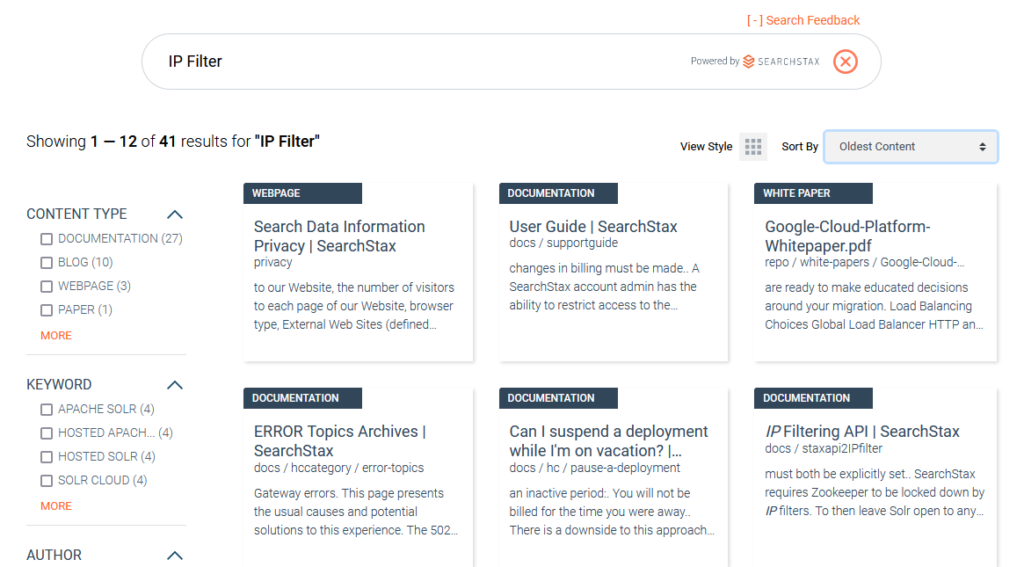
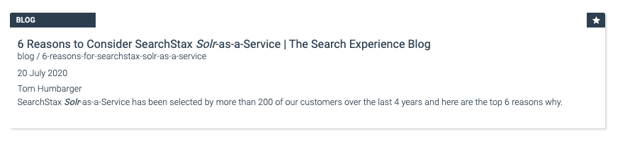
- title : required: This is shows as the header, on clicking which the “url” is openedurl: required: Field containing the URL that will be tracked and opened when the title is clicked onpaths: optional: Field whose data will be shown in a special style under the title (blog / 6-reasons-for-searchstax-solr-as-a-service styling shown below)ribbon: optional: Field whose data will be shown at the top of the tile as a ribbon. (Blog styling shown below)
- date: optional: Field that contains the date. Only if this field is present, sorting options to show search results by Relevance or Most Recent will be shown.
- thumbnail: optional: Field that contains the url of an image that should be shown in a special way as a thumbnail to the left of the search result item.
- connector.searchAdditionalArgs: optional: can be used to add any additional parameters that you would like to add to the Solr select endpoint. Example: “hl.fragsize=200&hl.simple.pre=<font color=’red’>&hl.simple.post=</font>”
- connector.hideUniqueKey: optional: can be used to hide the value of the Unique id/key (as defined in the schema) from the search results that are shown. Sometimes, the unique key is a url and you would like to display it, while sometimes it might be a UUID that you would not like to display.
- connector.autoCorrectSpellings: optional: can be used to automatically show results for spell-corrected queries when a misspelt input is searched.
- connector.defaultQuery: optional: can be used to provide the default query that the page should be loaded with. If you would like all results to be shown when your search page is first rendered, you can pass the defaultQuery as ‘*’
- fieldFormatters: optional: can be used to transform any field. For example, if your dataset contains the field as a long, or any other format, you can write a formatter to transform it into a readable date string. As shown in the example, for any of the fields, you can specify the formatter function that the module should call when showing the value of that particular field.
- display: optional: lets you control how the search results will be shown. Available options are grid(default), list and multi (Shows toggle option between list and grid)
- hideBranding: optional: Setting this value to True hides SearchStax branding from the SearchBox
- facet_pagination: controls how many facets should be shown in the UI by default, after which “More” is shown to view more facets. More lets user view the next “facet_pagination” number of facet values, with the max limit of values that are controlled from Site Search’s facet Max Count configuration
- suggestAfterMinChars: controls the minimum number of characters that should be entered in the search box at which the Auto-Suggest module should trigger and start offering suggestions.
- showUnavailableFacets: If false (default), when the user selects a facet value, all incompatible values disappear from the screen. If true, the incompatible values remain visible but are grayed out.
- orFacets: If false (default), the AND operator will apply for facet values. If true, the OR operator will apply for facet values. The true setting offers all facet values all the time, overriding the setting of showUnavailableFacets (above).
- searchOnSuggestionChange: if set to false, navigating through autosuggest items with keyboard keys will not trigger search
Settings for Sections showing various UI components:
- searchResults and customResultTemplate: The div for showing the search results and the id of the template html for that section. customNoResultTemplate is the template html for when search gives back no results.
- searchInput and customSearchTemplate: The div for showing the search input textbox and the id of the template html for that section.
- facetSection and customFacetTemplate: The div for showing the facets/filters and the id of the template html for that section.
- searchResultSummarySection and customSearchFeedbackTemplate: The div for showing the summary of search results (Like Showing 1-10 of 200 results for “Sitecore) anf the id of the template html for that section
- searchOptionsSection and customSearchOptionSectionTemplate: The div for showing the search options for sorting and display styles and the id of the template html for that section
- paginationSection and customPaginationTemplate: The div for showing pagination and the div template html for that section
- relatedSearchesSection and customRelatedSearchesTemplate: The div and template html for showing the Related Searches
- externalSearchResults and customExternalPromotionsTemplate: The div and template html for showing External Promotions
The templates for each section can be used for customizing the HTML layout of that section. Modifying them will require some knowledge on how to write Vue templates. The variables available in the template are:
- isGridLayout: Dynamic internal function that returns true if the layout is grid. You can use this to specify a different CSS for Grid Layout vs List Layout
- ribbon: Data for the configured ribbon field as returned by the search
- title: Data for the configured title field as returned by the search
- url: Data for the configured url field as returned by the search
- paths: Data for the configured paths field as returned by the search
- thumbail: Data for the configured thumbnail field as returned by the search
- date: Data for the configured date field as returned by the search
- snippet: Data for the configured snippet field as returned by the search
- result: contains all unparsed result data for more complex implementations
- promoted: Contains flag if the search result is promoted (true/false)
For the result to be clickable, a property @click=”navigate” should be placed on the tag.
Below are two example templates examples for the results section: Template 1: Show all configured fields.
<script type="text/x-template" id="result-template">
 <div class="card-searchstudio-js-custom" :class="{'card-searchstudio-js-grid-layout': isGridLayout, 'has-thumbnail': thumbnail !== ''}">
	<div class="card-searchstudio-jsClass">
      <div class="card-searchstudio-js-body p-0">
           <span class="badge" v-if="ribbon" v-html="ribbon" />
           <div class="card-searchstudio-js-title" v-if="title">
              <a class="stretched-link" v-if="url" :href="url" @click="navigate" v-html="title" />
              <span v-else v-html="title" />
           </div>
           <span class="card-searchstudio-js-path" v-if="paths" v-html="paths" />
           <span class="star elevated" v-if="promoted"> </span>
           <div class="thumbnail" v-if="thumbnail"><span><img :src="thumbnail"></span></div>

           <div class="card-searchstudio-js-body p-0" v-if="date || snippet">
              <div v-if="date"><div class="card-searchstudio-js-text"><span v-html="date" /></div></div>
              <div v-if="snippet"><div class="card-searchstudio-js-text"><span v-html="snippet" /></div></div> </div>

           </div>
      </div>
 	</div>
 </div>
</script>
Template 2: Show standard fields, and have a way to loop through and show any extra fields returned by the search, which are present in the raw result variable:
<script type="text/x-template" id="result-template">
 <div class="card-searchstudio-js-custom" :class="{'card-searchstudio-js-grid-layout': isGridLayout, 'has-thumbnail': thumbnail !== ''}">
	<div class="card-searchstudio-jsClass">
      <div class="card-searchstudio-js-body p-0">
           <span class="badge" v-if="ribbon" v-html="ribbon" />
           <div class="card-searchstudio-js-title" v-if="title">
              <a class="stretched-link" v-if="url" :href="url" @click="navigate" v-html="title" />
              <span v-else v-html="title" />
           </div>
           <span class="card-searchstudio-js-path" v-if="paths" v-html="paths" />
           <span class="star elevated" v-if="promoted"> </span>
           <div class="thumbnail" v-if="thumbnail"><span><img :src="thumbnail"></span></div>

           <div class="card-searchstudio-js-body p-0" v-if="date || snippet">
              <div v-if="date"><div class="card-searchstudio-js-text"><span v-html="date" /></div></div>
              <div v-if="snippet"><div class="card-searchstudio-js-text"><span v-html="snippet" /></div></div> </div>
              <div class="card-searchstudio-js-body p-0" :key="propertyName"v-for="(value, propertyName) in result">
                  <div v-if="displayProperty(value, propertyName)">
                      <div class="card-searchstudio-js-text" :class="propertyName">
                          <span class="image" v-if="isImage(value)">
                              <img :src="value">
                          </span>
                          <span :class="valueClass(value)" v-html="extractedValue(propertyName, value)"v-else />
                      </div>
                  </div>
              </div>
           </div>
      </div>
 	</div>
 </div>
</script>
- If using the Optional Search Feedback, initialize the plugin as shown below:
<script type="text/javascript">
     (function (w,d,s,o,f) {w['sf-widget']=o;w[o] = w[o] || function () {(w[o].q = w[o].q || []).push(arguments)};
     js = d.createElement(s);fjs = d.getElementsByTagName(s)[0];js.src = f;js.async = 1;fjs.parentNode.insertBefore(js, fjs);}
     (window, document, 'script', '_sf', 'https://static.searchstax.com/studio-js/v2/js/studio-feedback.js'));

     _sf("9irZHJbDKzVGnjJjEGgzOVWLt8e2OAHv6krBuf5uvSY");
   </script>
The parameter to _sf method is the Analytics API Key that is also used before as the connector.apiKey parameter.
Full Example:
The Hosted Search App is a search page built with the SearchJS Module using your Solr and Site Search settings. Simply view the page source for the most up-to-date example of SearchJS integration.
Questions?
Do not hesitate to contact the SearchStax Support Desk.