
Editing Themes in SearchStax Studio
Studio > Search > Theme Editor
Theme Editor is deprecated!
Theme Editor will no longer be supported after November 30, 2023. We encourage you to view our other Search UI options.
The SearchStax Studio Theme Editor lets a UI Developer or a Tech-Savvy Marketer begin with a fully-functional Studio experience and modify its appearance, layout, and labeling. The page is already integrated with Studio UX accelerators, so the UI Developers don’t need to know anything about how the search page works. They just adjust layout, colors, fonts and styles to complement their own websites.
UI Developers are then able to preview those changes within the Studio, and publish their Search Experience by clicking a button. This lets them share their work with other stakeholders to get real-time feedback for very rapid development.
For Expert Users…
Note that the Theme Editor is not intended for business users. To edit themes in the Studio, you must be fluent in SaaS-based Web Software development, and in both HTML and CSS.
Theme Editor Capabilities
What does the SearchStax Studio Theme Editor help you do?
- Start with a predefined base theme to avoid building a search experience page from scratch.
- Interactive web-based editor that allows you to customize each component of the search page independently.
- Ability to customize certain settings such as grid view vs. list view).
- Preview changes using the data you have in your application, without having to publish your changes to a third-party web server.
- Share your work with other members of the team and get feedback before integrating with your application.
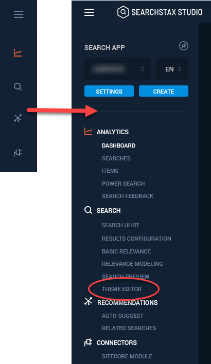
Where is the Theme Editor?
Where is the Theme Editor inside of the Studio? Open the left-side navigation menu and look under Search.
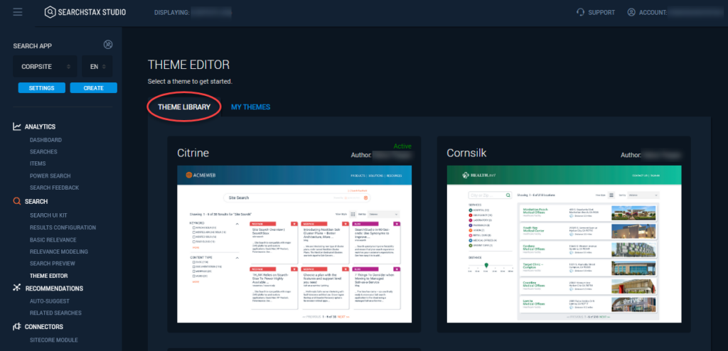
Theme Library Tab
The Theme Library presents a selection of default themes that you may use as the basis of your customized Studio theme. The default themes are not modifiable, but any of them can be cloned and renamed for your use.
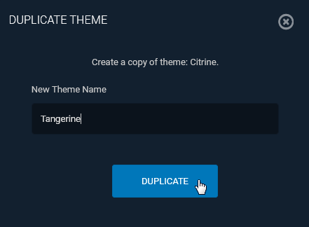
To clone a default theme, simply hover the mouse over the theme image and click the Select button.
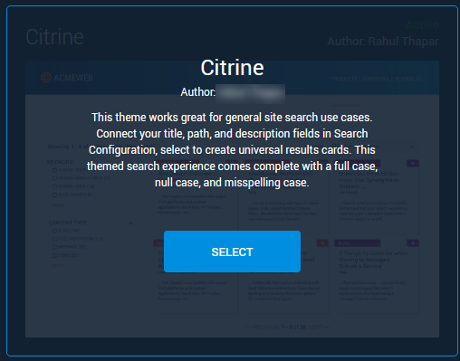
The Studio asks you to give the new theme a name.
My Themes Tab
The custom themes under development by the members of your team are listed on the My Themes tab.
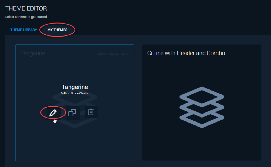
To edit a theme, click the pencil icon. That opens the custom theme in the Theme Editor.
Navigating the Theme Editor
The Theme Editor packs a lot of function into a single view, largely by layering different editors into a single screen as they are needed. Let’s take a moment to explore how to move from one feature to another in this environment.
Your initial view of the Theme Editor shows some tool icons above a live Search Experience window. This window is connected to your Solr instance, and is fully-functional. It not only responds to queries, but it also records user events for later analysis.
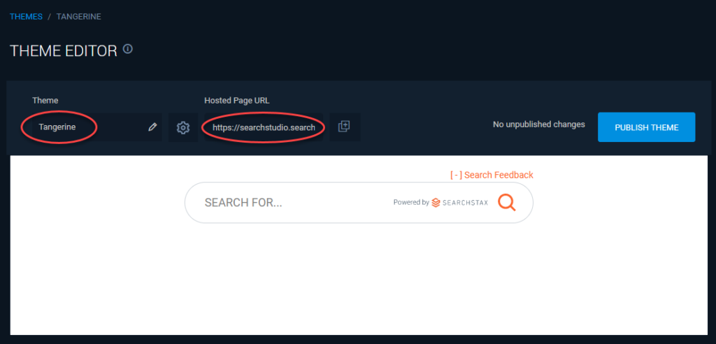
The Pencil icon ( ) lets you edit the name of your custom theme. The Hosted Page is a sharable search page that uses your theme. The copy icon (
 ) lets you copy the Hosted Page URL to the clipboard, so you can paste it into a browser address field. The Publish button releases the current state of the theme to the Hosted Page.
Note that a given Studio App can publish only one theme at a time.
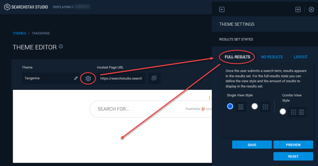
Theme Settings
To customize the Theme, you’ll need to expose the Theme Editor’s HTML and CSS editors. Click the Gear icon ( ) to open the Theme Settings panel. Note that this display has three tabs:
- Full-Results: An editor exposing the HTML and CSS for all features involved in searching and displaying results.
- No Results: This editor gives you access to the features of the No Results page.
- Layout: This editor lets you rearrange the elements of the Search Experience, adding or removing controls as you see fit.
It turns out that we were already looking at the Full Results view. You can see the results (your own data) by typing a keyword into the search field:
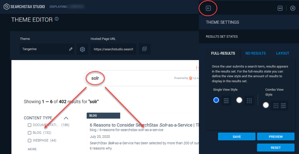
You’ll notice that the Theme Settings editor overlies and obscures part of the Full Results display. Look for a left-arrow link ( ) at the top margin. It lets you move the Theme Settings to the opposite side of the screen. Once there, there’s another link to bring you back.
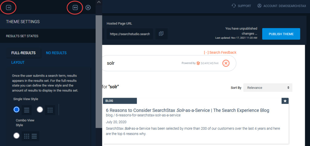
You can also make the Theme Settings Editor larger, which helps when you are editing blocks of HTML or CSS. Look for the “wider” button ( ). It makes the editor twice as wide.
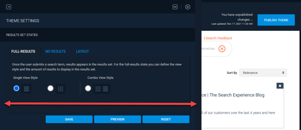
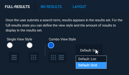
On this editor you’ll find a block of controls that let you set the default result-display behavior (List, Grid, or Custom (toggle). Change the setting and then click the Preview button.
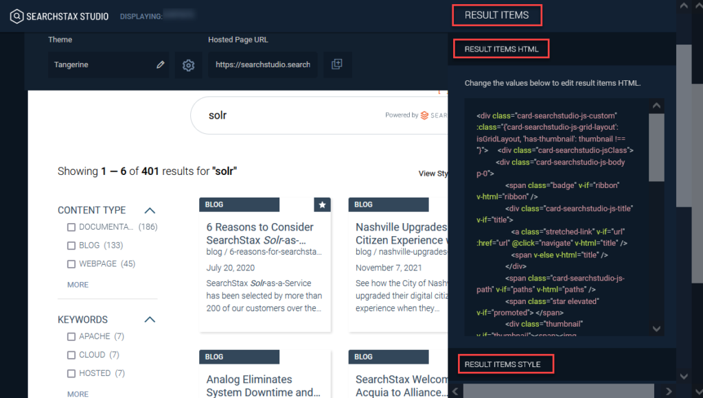
Result Items Editor
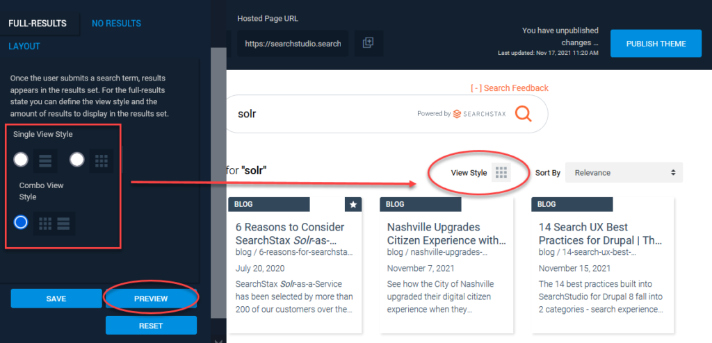
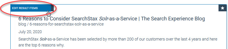
To expose the HTML and CSS editing fields, hover the cursor over the part of the Search Experience that you want to modify. Click the blue button that appears for that region. In the image below, we want to edit the Results Items.
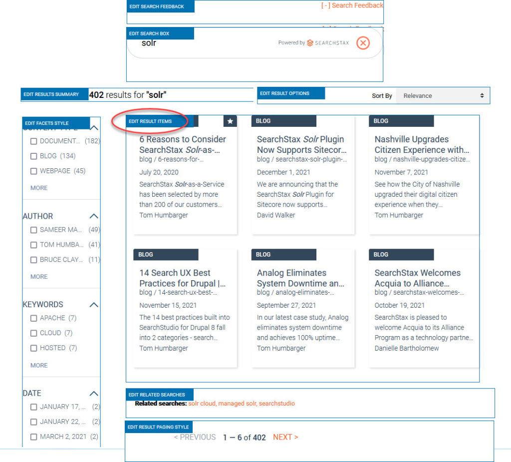
This exposes the Result Items Editor. (There is an editor for each customizable part of the screen.) The Result Items HTML field contains the HTML block that encodes each result card. Below it is the Result Items Style field, which holds the CSS rules that apply to result cards. Finally, note the Close icon ( ) in the upper right. You can close the editor pane at any time without losing your changes.
At the bottom of the editor pane are three buttons:
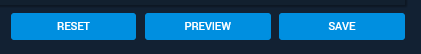
- Reset: Returns the code windows to the state they were in the last time you saved the code.
- Preview: Refreshes the view of the Search Experience so you can see the effect of your changes in real time.
- Save: Saves your changes to this theme.
Remember that you can close the editor pane to expose the Publish button. That one updates the Hosted Page URL and makes your Theme available to your reviewers.
Scroll Bars
When the HTML and Style editor fields are open, the Theme Editor offers four different scroll bars. Each scrolls a different region of the screen.
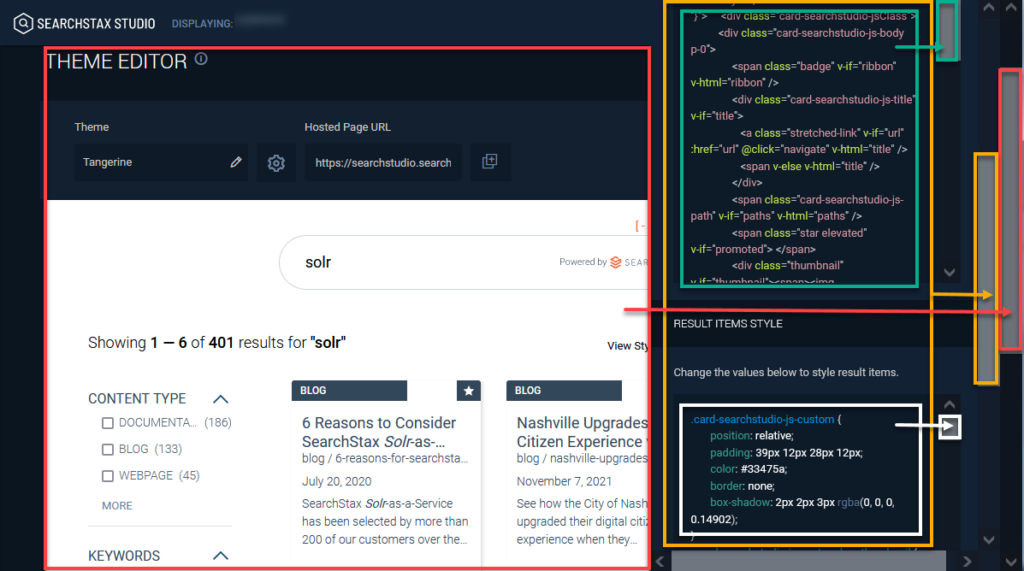
Note that the code-editing panel is scrollable (orange box, above), and contains the HTML and STYLE editing fields (green and white), both of which are also scrollable.
Common Theme Editor Tasks
Users who are new to the Theme Editor ask us how to perform some common tasks.
- Remove “Powered by SearchStax” Logo
- Remove Feedback Widget
- Add your Company Logo
- Change Result-Card Fields
- Change Result-Card Badges
- Change the Promotions Icon
- Format Facet List
- Change Hit-Highlighting Style
- Change the “No Results” Message
- Show List View Only (Not Grid View)
- Move Facets to Right Side
- Move Related Searches to Top of Results
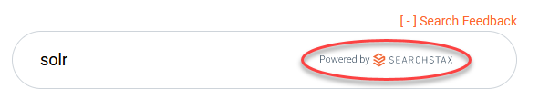
Remove “Powered by SearchStax” Logo
When adapting a Studio Hosted Page to better fit an existing company website, clients often ask to remove the “Powered by SearchStax” logo from the search field.
Click in the upper-left corner of the target control to open the Search Box HTML and Search Box Style editors.
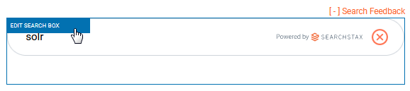
In the Search Box Style editor, scroll down to the declaration block that mentions the .input style. Comment out the background property using /* comment */ delimiters.
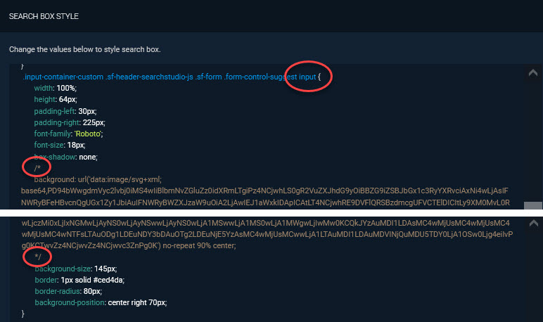
The logo is a background bitmap coded as a base64 image. Put /* just before the background property and */ at the end to comment it out. When you are successful, the property will change color.
Then Preview the change.
If it is satisfactory, Save the theme.
Remove Feedback Widget
Some clients have no plan to collect user feedback. They would like to make the Feedback Widget disappear from the Search Experience.
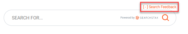
Click the gear icon  and select the Layout tab. Use the Show on left side link to move the code panel out of the way so you can see the Feedback Widget.
Use <!-- and --> to comment out the feedback-wrapper <div> element. Click the Preview button.
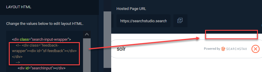
If the result meets with your approval, be sure to Save it.
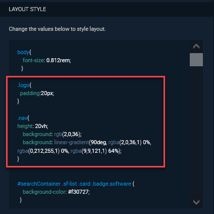
Add Your Company Logo
Studio clients frequently ask us how to insert their company logo into the Search Experience page.
Click the gear icon and select the Layout tab. Scroll down to the Layout Style editor. In our example, we created a new style (.logo) to put some padding around a logo image, and another (.nav) to create a broad blue navigation bar across the top of the screen.
.logo{
  padding:20px;
}

.nav{
height: 20vh;
    background: rgb(2,0,36);
    background: linear-gradient(90deg, rgba(2,0,36,1) 0%, rgba(0,212,255,1) 0%, rgba(9,9,121,1) 64%);
}
Then scroll back up to the Layout HTML editor. At the very top, create a new <div> element to contain the <img> link.
<div class="nav">
  <img  src="/assets/img/icon-account-popup.2767ba37.svg"
  width= 200px; class="logo">
</div>
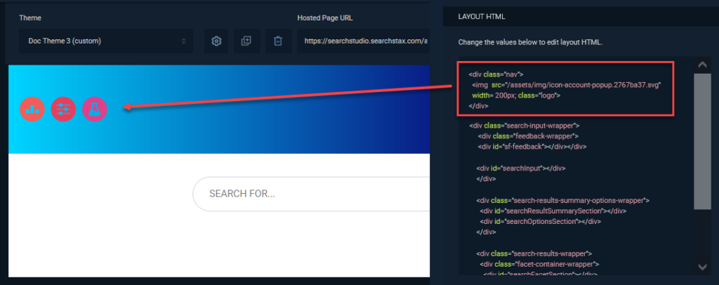
Remember to Save your changes and, if appropriate, to Publish them.
Change Result-Card Fields
How do you adjust the appearance of the result-card fields? For instance, how do we change the color of the result title?
View the Result Items editor. (Click in the upper-left corner of the results area.)
Scroll down through the Result Items Style declaration blocks until you find two that mention the .card-searchstudio-js-title style.
.
Look for font-related declarations. Modify them as you see fit. For instance:
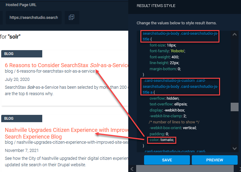
Click the PREVIEW button. Save the change.
Other result-card fields are approached in the same way:
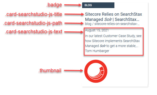
Change Result-Card Badges
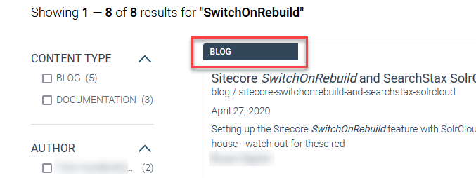
This example follows the same basic procedure as the previous one, but with a different goal. The “badge” of a result card is the label in the upper left that usually says “Blog” or “Documentation” in our SearchStax demos.
By default, the badge in Citrine-based themes shows white text on a black field.
Suppose we want to change the background color of this label. Open up the Result Cards Editor and scroll down through the Result Items Style CSS editor. Look for rules that mention .badge.
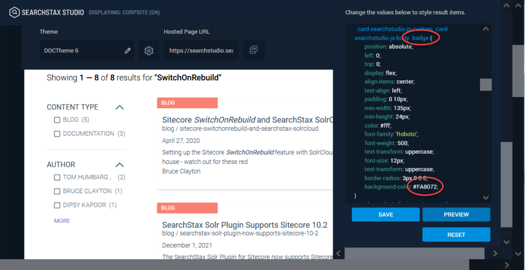
When you find one that has a background-color property, edit in an HTML color code. Click Save and Preview. The badges will change color.
Change the Promotions Icon
“Promoted” result-items are flagged by a star icon ( ) by default.
Suppose that you wanted to use a “sparkler” icon ( ) instead. How would you go about making the substitution?
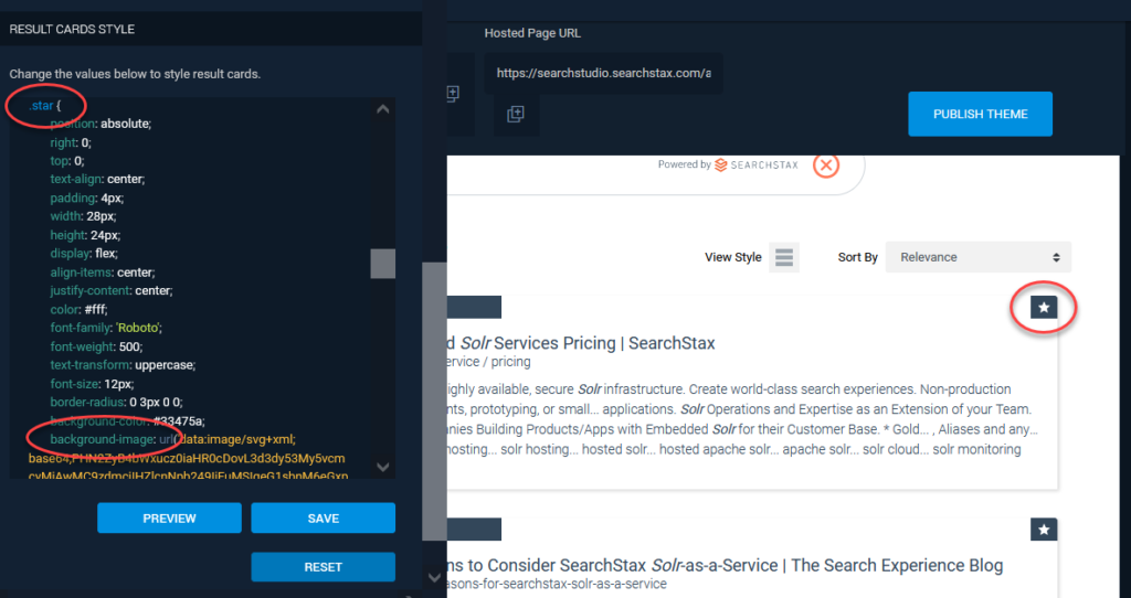
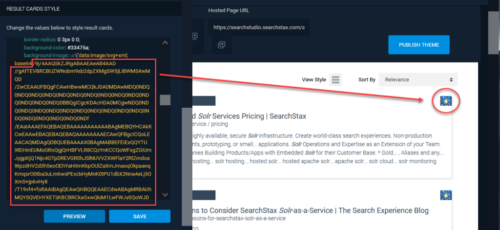
Open the Result Items Style editor and look for the .star declaration block. The background-image property contains a base64-encoded image of the star icon.
One solution is to use an on-line site to convert the sparkler icon into a base64-encoded string. Then simply paste the new encoded image over the old one in the CSS and Preview the result.
Note that the .star style has a background-size property that can be used to adjust the size of the image on the card.
Format Facet List
To adjust the text formatting of the facet values, click on the Edit Facet Style button at the top of the facet column. This opens the Facets HTML and Facets Style editors.
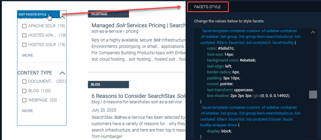
Look in the Facet Style editor for a declaration block containing text-transform: uppercase as shown below. (There are several of them.) Change it to say text-transform: capitalize, and click Preview.
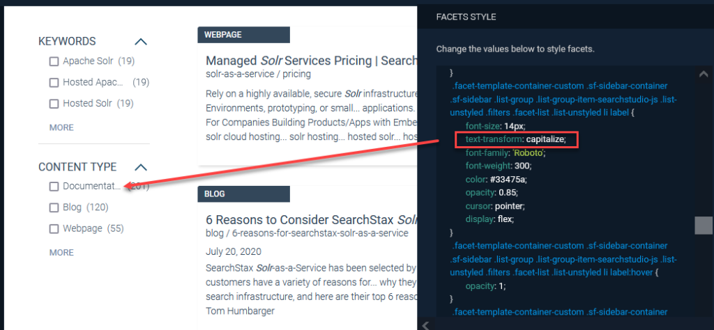
You might have to experiment to find the right declaration block. Use the Reset button after each unsuccessful attempt, and the Save button when the change succeeds.
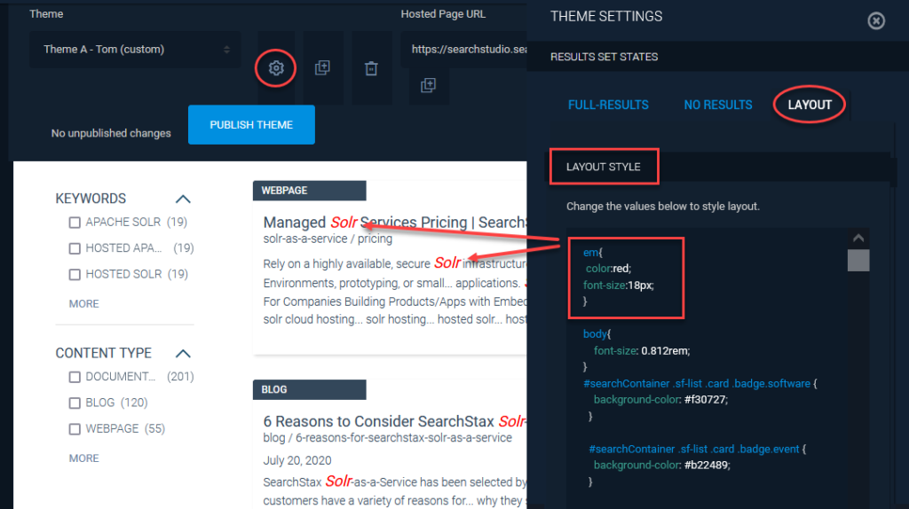
Change Hit Highlighting Style
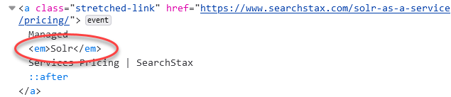
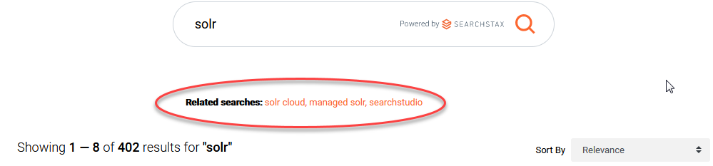
The Hit Highlighting feature adds emphasis to the keywords in the result that match your query. For instance, if you search for “Solr”, the result-item is returned with all “Solr” terms wrapped in <em> styles.
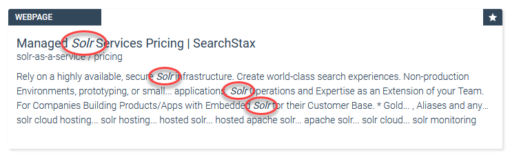
To change the <em> styling, click the gear icon and select the Layout tab. Scroll down to the Layout Style editor and enter a new definition for style em. Click the Preview button to see the change take effect.
Change the “No Results” Message
How do we change the message that appears when Solr returns zero results?
Click the gear icon and select the No Results tab. Scroll down in the No Result HTML editor looking for paragraphs <p> of text. Edit as needed. Click the Preview button to see the change take effect.
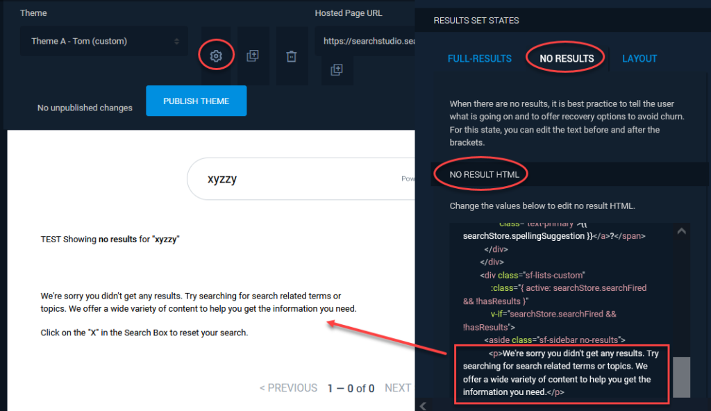
Finish by saving the change.
Show List View Only (Not Grid View)
The Studio can display result-items in either a list view or a grid view. How do you restrict it to offer only one or the other, but not both?
This is an easy one. Click the gear icon . The controls for List and Grid views are right there. You may have a single view, or a toggle selector with either view as the default. Remember to Preview, Save, and possibly Publish.
Move Facets to Right Side
Some clients prefer to have their facet controls on the right side of the screen. How difficult is it to make this change?
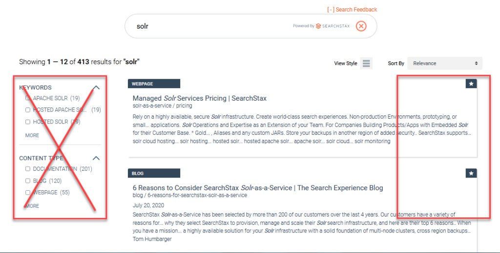
Click the gear icon and select the Layout tab. In the Layout HTML editing field, locate the facet-container-wrapper <div> element.
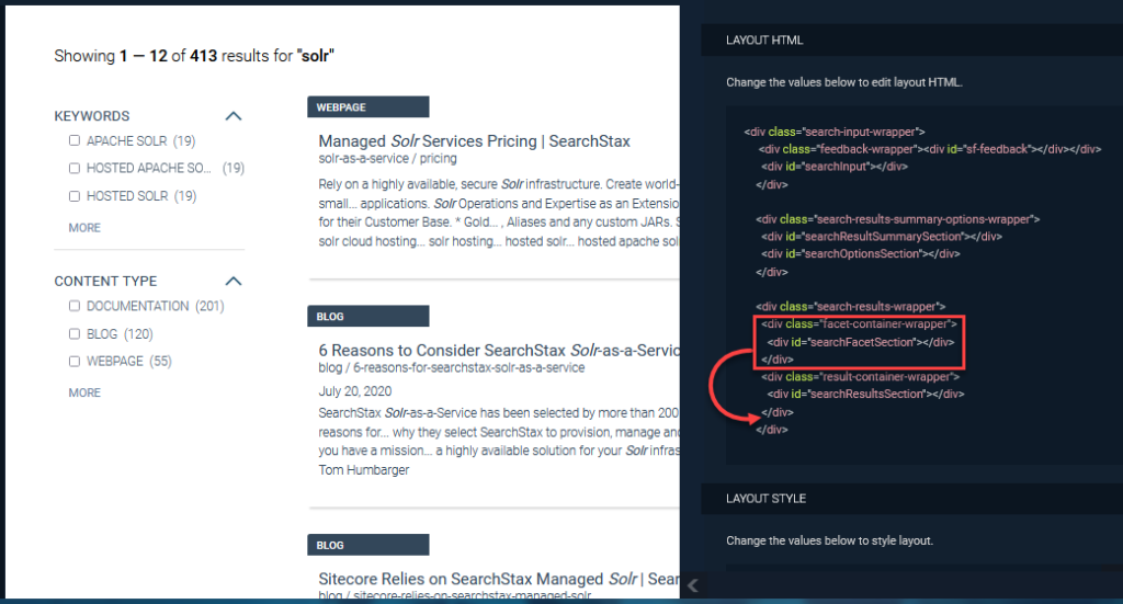
Move this element down below the following one, and click the Preview button.
Don’t forget to Save it.
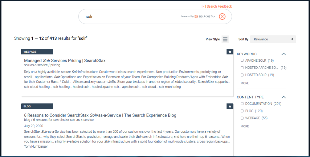
The field displaying Related Searches appears by default at the bottom of the Search Results list. What if you would like it to be just beneath the Search Input field instead?
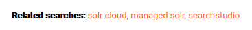
Click the gear icon and select the Layout tab. Locate the related-searches-section <div> element near the bottom of the Layout HTML editing field, l.
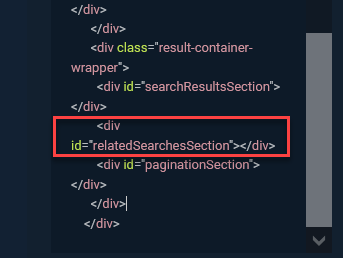
Cut out this <div> element and paste it into the search-input-wrapper <div> element near the top of the Layout HTML editor.
Click the Preview button. The Related Searches display is now above the list of Result Items.
Be sure to Save it.
Questions?
Do not hesitate to contact the SearchStax Support Desk.